
Emulators vs Real Devices
Mobile Responsive Test across range of Mobile Devices and platforms is extremely important for superior User Experience. However, Mobile Responsive Test and debugging can get knotty, especially when there are issues like obfuscated HTML/CSS/javascript code, improperly implemented HTTPS, browser inconsistencies, page load performance and so on. So how do you overcome these issues? Using a Web Developer Tools or debugging extensions make debugging your web application easier. Here we’ll talk about the most popular one – Google Chrome Developer Tools.
The Google Chrome Developer Tools is a consolidated environment built into Google Chrome Browser. It is used for web authoring, debugging, monitoring, optimizing, and understanding web applications or websites. (Sourced from Google Chrome DevTools)
A responsive testing simulator provides a virtual environment where you can test the functionalities just like in a real device. You can also test websites on mobile devices online and test websites on different screen sizes. It is easy to perform responsive design testing across devices on a simulator.
Here are some of the key Chrome DevTools features
- Inspect and edit the DOM and CSS of your website in real-time
- Run code snippets from any page
- Debug Obfuscated code
- Set advanced breakpoints and debug JavaScript using graphical debugger
- Troubleshoot Security issues
- Analyze run-time and page performance to improve the speed of your app
- Trace reflows and repaints as your app loads
The Chrome DevTools provides almost all the gears required to inspect, debug and monitor the performance of a Web App/mobile web. It also provides additional capabilities to simulate Mobile Devices to test and build mobile-first, responsive web sites. You can even debug web content on a real Android Device from a development machine. But, is it enough to perform Mobile responsive test on one or two devices?
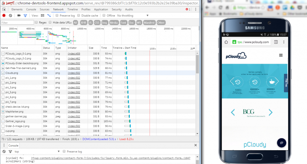
Remote debugging using Chrome DevTools in integration with pCloudy’s Mobile Device Lab
Device fragmentation is a very real problem when testing Web apps on real devices, particularly for UI and functional tests. The number of devices with unique specifications and proprietary build variations has increased. At an advanced level, to perform Mobile Responsive Testing and to check performance of the Web App on real devices, you will need to experiment your site on various platforms, across a number of device form factors. pCloudy’s Mobile Device Lab offers complete integration with Chrome DevTools to test your apps on real devices. This integration allows you to test Web Apps on a myriad of android devices with different sizes and configurations.
Here’s how most App developers test their Web Apps
Inspect and live edit your site’s design and content
Test and edit your site in live mode by inspecting all the HTML and CSS in your page. In the Elements Panel, you can live-edit a DOM node by simply double-clicking a selected element and making changes.
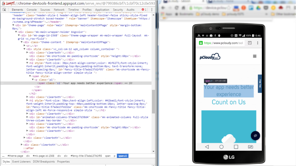
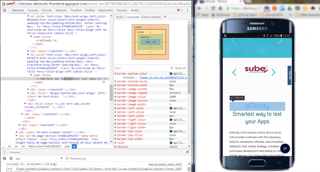
You can even live-edit style property names and values in the Styles pane. Examine and edit box model parameters.
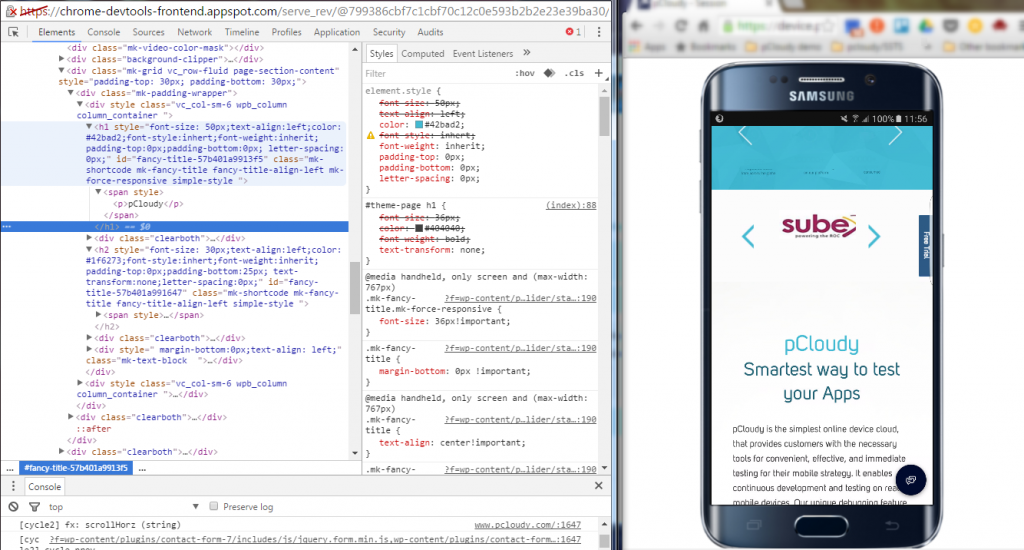
It is also possible to edit the current element’s box model parameters by making changes to top, bottom, left, right values for the current element’s padding, border, and margin properties using the Computed pane.
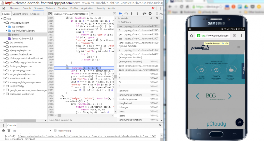
Remote Debugging on real devices to fix errors in the code
Debugging Obfuscated Code: Make your code readable and easy to debug even after you’ve combined, minified or compiled it. You can easily change the formatting of your minimized code by clicking on { }.
Test and optimize the performance of the Web App
The Network Panel allows you to see how your page renders, and time taken to render from start to end. To do this click into the “Network” panel, click on the camera icon and refresh the page on the device.
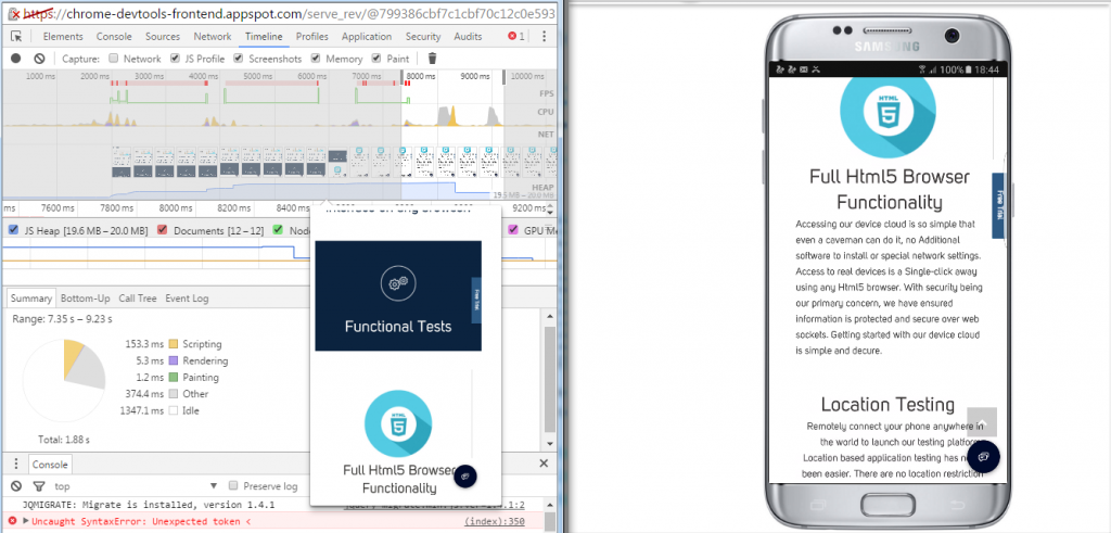
The Timeline panel helps you to record and analyze all the activities in your application as it runs. It’s the best place to start investigating perceived performance issues in your application.
To make a recording of a page load, open the Timeline panel, open the page that you want to record, and then reload the page. The Timeline panel automatically records the page reload. You can also record page interactions on the page and view the performance details through the recorded timeline.
Here are some more details you can view using the Record Timeline
- Record the Timeline to analyze every event that occurred after a page load or a user interaction
- View FPS, CPU, and network requests in the Overview pane
- Click on an event within the Flame Chart to view details about it
- Zoom in on a section of a recording to make analysis easier
There are some things to be kept in mind while performing responsive testing:
Device selection
It is better to ask your business analyst or your manager which devices we need to perform the testing. Creating a device matrix is a tedious job due to device fragmentation with frequent browser and OS updates. Even if you spend a lot of time on making a strategy for the combination of devices, that may not get approved by the product manager or scrum master.
Automation testing and Manual testing
It’s better to use both automated and manual approach to perform testing. Based on the type of testing you can share the effort like 70% automated and 30% manual. It is obvious that sometimes automated testing will miss something that a human eye can see. A tool clicking on a link or zooming in and out is different from doing it manually.
Emulators, simulators and real devices
If you wish to test your app on many verities of devices then you can also opt for emulators and simulators. It won’t be possible for you to set up a device lab as it will cost a lot. So you can use a real device that is popular in the market and emulators for the devices that are not that popular.
Prioritize
Mobile app testing including mobile responsive testing needs to be perfectly prioritized as testing is a time-consuming process. Responsive testing priority should be discussed with the BA and the product manager well in advance and take some suggestions from them. The issue is that there are a plethora of devices and while prioritizing, the most popular devices will be used first for testing.
Conclusion
“Using the right tools for the right job” is an old aphorism that applies to all domains including Software Development. As we’ve seen, Chrome DevTools has several features that help you develop better, debug faster, and measure efficiently the performance of your website or application. An ideal choice for you for Mobile Responsive Testing.
The features discussed in this blog are some of the most common ones used by developers, designers, and testers to write, debug, monitor and optimize Websites and Web Apps. Using these features in integration with Mobile Device Lab like pCloudy can transform the entire process of creating, testing and launching Websites and Web Apps.
For more information check out this video:
Related Articles:
 September 20, 2017
 July 25, 2017