

Introduction
The Internet is inevitable in the current time. It is everywhere and the entire world depends on it to function, perform day-to-day activities and stay connected with people from different corners of the world. Gone are the days when testers only chose to create websites for selected browsers and hardly faced issues maintaining a website on a few browsers. As the technology matured, many significant players entered the browser market. Even the users evolved, became tech-savvy, and improved their browsing habits. Now was a time when businesses were in critical need of cross-browser testing and responsive testing to stay ahead of the competition. Cross browser testing focuses on the overall functionality of the website, responsive web testing verifies the look and feel of the web application. Cross browser testing deals with the analysis of the web browsers that their users use, responsive testing deals with the devices where the companies user base visit the websites. Let us shed some light and understand cross browser testing and responsive testing in detail.
What is Cross Browser testing?
We all know that testing cross browser compatibility of websites“ is of utmost importance. It helps understand how stable your web application is across various technologies, browsers, operating systems and devices. The reason behind the adoption of cross browser testing is to provide a better user experience irrespective of which browser-OS-device combination your users use to access your website. In cross browser testing, the testers generally validate the functionality of the web application and make sure its user-friendliness and performance are up to the mark across the web browsers, as intended. Businesses can also take the help of cloud-based automated cross browser testing tools to have access to a wide range of real devices to test their web and mobile applications. Different browser engines render websites differently; even the version of each browser renders the code uniquely. It means the code behind the websites is read differently by every browser. So, various cross browser testing strategies are critical for website accessibility. It is how different browsers render a web page:
Importance of Cross browser testing
Developers put in a lot of effort to build a website and imagine if they created an impeccable website for one browser, but it failed to perform on the other browsers, all the efforts go in vain. If you do not perform cross browser testing for your websites before releasing them for final use, this will undoubtedly lead to a bad user experience. It will impact the user base; users might leave your website due to a bad experience. To retain your customers, you must provide an incredible and consistent user experience so that they do not switch to the competitor’s website. Cross browser testing will ensure that all of this is achieved for better accessibility to users.
Cross Browser Testing can be performed either manually or automatically. Both have their respective advantages. Automated cross browser testing helps in eliminating repetitive test cases and expedites the resting process. Manual cross browser testing helps the testers create better test scenarios to generate automated test scripts.
What is responsive testing?
Ethan Marcotte was an independent web designer who coined the term web responsive design in 2010. He explained that responsive design and development of web pages should be done in such a way that it behaves well on all types of devices, sizes, layouts, platforms, etc. Time has changed. Earlier, there were limited browsers, so testing them was easy, but today most users browse the internet on mobile devices, tabs, etc. So to ensure that your website has a mobile/ tab version that responds well to the mobile/tab device. There are so many web technologies that are used to create web applications. Web technologies in the present time have become so strong that they changed the way browsers are used to render the website code. It involves HTML, JS, CSS code, which is responsible for rendering content on different devices as the user prefers to access website content.
Download a free Responsive Testing Checklist for improving User
Responsive testing is a process that renders web pages on viewports of multiple devices using CSS media queries based on the user device where the website is accessed. In simple terms, responsive testing ensures how responsive web design is optimized well for all types of screen sizes and resolutions. A business that owns a website that works well on all screen sizes, has more chances of capturing the user base and remains ahead of the competition. There are several components of responsive web design like flexible layout design, media queries, media and typography which are taken care of while designing the website. Responsive design involves the practice of building flexible layouts using flexible grids. It allows auto-adjusting the size whenever the website dynamics like width, margins, length, etc., change. No matter how easy it may seem, incorporating responsive design in an ongoing project is quite difficult. It is better to follow its guidelines before starting any project.
Responsive design testing is the last stage of testing as per the guidelines of responsive web design. Cross Browser testing and responsive testing can use the same tools to perform testing. Both Cross Browser Testing and Responsive testing are responsible for enhancing the UI and UX. Responsive testing is so powerful that it can detect the unresponsiveness of the web page and flexibly adjust the web pages as per the changes in the screen resolution. Below is how an unresponsive website looks on different devices.
Importance of Responsive Design Testing
There are a variety of devices used today to access the internet. The number of internet-enabled mobile devices is constantly rising for performing different activities like browsing, online shopping, accessing social networks, entertainment, etc. So, it becomes essential to test your website usability and compatibility across different mobile devices. For best user experience, perform responsive design testing for checking the following aspects:
- Check all links and URLs on different browsers and devices
- Check how the websites load on different devices
- Check the changes in the web content as the screen resolution changes
We have detailed information about Cross Browser testing and responsive testing, but it is still necessary to understand which one to choose. It is important to note that no matter how unique their role is, they have a common purpose, i.e., creating a great user experience. Whenever you perform cross browser testing, you should always adhere to the principles of responsive design. Testers should make use of cross browser testing wherever any platform-related risks are identified. Whereas to test specific responsive web design features, they should utilize responsive web design testing to test standard web design features.
How can I test if my website is responsive?
There are many tools available in the market to check the responsiveness of the browser. Let us see how to check the responsiveness of the website on Google Chrome.
- Open the website you want to visit on the Google Chrome Tab
- Right Click on the Homepage to open a drop-down Menu
- Click on the “Inspect” option from the list
- Click on the Toggle Device tool on the top left of the open ‘Inspect’ screen (marked in Red in the picture below:

Now, you can see how your website looks on different screen sizes/devices by clicking on the toggle icon.
The common goal of Cross Browser Testing and Responsive Testing
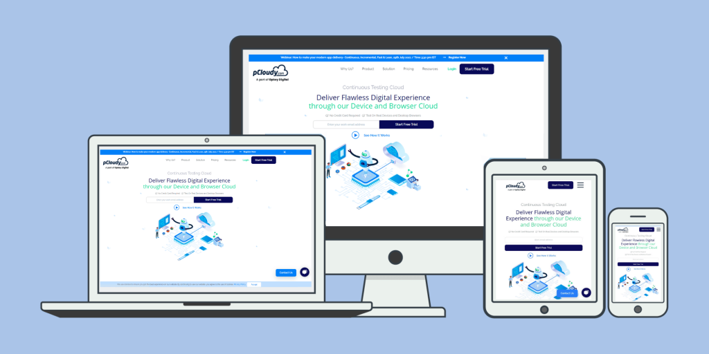
Cross Browser Testing and Responsive Testing serve towards the common goal of providing a seamless consumer experience. Responsive web testing is an integral part of the cross browser testing process. pCloudy is a cloud-based cross browser testing platform (manual/automation) that provides access to thousands of real devices and browsers so that the testers can keep an eye on the website performance on a real-time basis and handle any cross browser compatibility issue. The tools help perform live testing on virtual machines based on different browser-OS-device combinations.
Automation testing helps running parallel tests, helps to maintain network logs, take screenshots, video recording, etc. On top of this, it helps create test reporting to keep a record of all test cases execution. It is suggested that organizations create a balanced mix of browsers relevant to your business to perform cross browser compatibility testing of your business’ website on all device-browser-OS combinations.
Challenges in Cross-Browser and Responsive Testing and How to Overcome Them :
While cross-browser testing and responsive testing are crucial components in the web development process, they do come with their set of challenges.
Multiple Browser/Device Combinations: With countless browser versions and an ever-growing list of devices, testing every single combination can be time-consuming and practically unfeasible. Automation testing tools can assist in handling this complexity by performing simultaneous testing on different combinations.
Keeping Up With New Releases: Browser vendors frequently release new versions, and new devices with different screen sizes are constantly hitting the market. It’s essential to keep your testing tools and practices up-to-date to cover these new releases.
Diverse User Preferences: Users customize their browser settings according to their preferences, which adds another layer of complexity to testing. A sound understanding of your user base and extensive user scenario testing can help to accommodate this diversity.
Adapting to Different Network Conditions: Network speed and stability can significantly impact a website’s performance. Testing should be performed under various network conditions to ensure optimal site performance under all circumstances.
Strategies to Overcome These Challenges
Leveraging Cloud-Based Testing Platforms: Cloud-based testing platforms offer access to a broad range of browsers, devices, and operating systems, which can help manage the multiplicity of testing scenarios.
Prioritizing Based on User Analytics: Analytics data can provide valuable insights into the most commonly used devices, browsers, and operating systems among your user base. Prioritize testing on these combinations to ensure the best experience for the majority of your users.
Regularly Updating Testing Tools: As browsers update and new devices enter the market, it’s essential to keep testing tools up-to-date. Automated testing tools often have built-in mechanisms for updating to accommodate new browser versions and devices.
Simulate Different Network Conditions: Use testing tools that can simulate different network conditions to ensure your site performs well even under less-than-ideal network conditions.
Conclusion
Browsers are continuously being updated and to make your website compatible with every possible update that happens, cross browser testing plays a critical role. Web design responsiveness is covered as a part of Cross browser Compatibility issues. Both Cross browser and responsive design testing are responsible for offering an incredible user experience. Whenever any new project is introduced, the testing team should always follow the responsive design guidelines while designing a website to make the website cross browser compatible and responsive across different browser-device-OS combinations.


